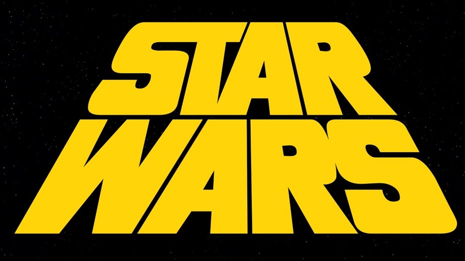
The Star Wars logo is recognizable in many places because of its international success, the films that began to be shot in the late 70s, did not have a defined graphic identity, so there are different versions of the logo before it even the first movie will be released. The idea of George Lucas evolved as it progressed, so during the filming of «A New Hope» in 1975 he used the name «The Star Wars» (which is the real name of the film, since it was called different until the sequel would come out) and a decal to mark the ribbon cans, which had the logo and a sketch of the character with a lightsaber framed by a triangle. This would be considered as the first imagotype of the saga.

As the production progressed, the artist and typographer Dan Perri was commissioned to create a special font for the design, which was based on a vanishing point, this technique was also used for the sliding introduction that many will recognize. This version was used in the posters to promote the film.

It took a few years for all the promotional products to unify the logo, and when everything seemed uniform «The Empire Strikes Back» arrived to modify it once again. This version loses the fascist intention and the angle gives it adventurous movement and speed.

And the same thing happened for the last part of the trilogy «The Return of the Jedi» gave more emphasis to the title of the film and moved the Star Wars to a higher part.

By the time a «prequel trilogy» was announced, the decision was made to build a single logo for these, so as in the last movie, the word «Star Wars» is at the top, but this time they give more importance to the numerology of the episodes, so it is the most visible, below this they add the individual titles «The Phantom Menace», «Attack of the Clones» and «Revenge of the Sith».

In the mid-10s and after the purchase of Lucas Film by Disney, it was announced that there would be 3 more films that would be sequel to the original trilogy, of which two have already been released. In this new version, the logo that represents the «Star Wars» saga was added, the title of the tapes was added in the middle of the words with a simple typography.

Finally there are the derivative films, and what they call a Star Wars story, in the first «Rogue One» the logo shows the title enclosed by a box and like a small brooch the badge «A Star Wars Story».

In the case of «Solo, A Star Wars Story» the importance is given to the surname of Han, but the design is reminiscent of «The Empire Strikes Back» but with a yellow color to approach the official.


